Among the reasons I have enjoyed putting together the 1959 Topps baseball set is the aesthetic appeal. The combination of posed photos and portraits and the circular frames made it stand out from the other sets I considered. I'm a fan of the '58 set because those cards are the first I actually remember being aware of. The 1960 set was the first I actively collected. But the '59 just kept stood out.
When I jumped into putting the set together I already owned the Orioles and a group of stars and commons, maybe 20 or so. I noticed that the Orioles' team 'set' was mostly of the yellow 'frame' variety with some blue and red cards mixed in.
As I picked up more and more cards it was apparent that some teams seemed to have one predominant colored frame. I knew that at some point I'd like to sit down and track the set's colors. I started the project a few times and finally had the time recently to sit down with my binder and catalog them one by one.
I made a simple spreadsheet to tally the colors as I flipped the binder pages. I made a few notes as I went along as well. Before giving the breakdown in the next post there should be some discussion of the colors themselves.The base, one player cards come in nine different color frames. Those colors are red, yellow, black, pink, orange, light blue, dark blue, light green and dark green. Each of the colors has a consistent pattern of frame/player name/team name/position. All except one. When cataloging colors I began with ten colors. I had looked at the orange cards and seen at least two differing shades. But the more I looked the more convinced I became that the variations are simply due to the vagrancy of color printing in the late 50s. Even laying out the red cards side-by-side revealed some variations.
A look at each color in turn:
RED:
Red cards vary slightly in shade but it's seems obvious that the differences are just variations in the printed sheets. Red cards are where we see the difference in complimentary colors. Most have player names in white, team name in yellow and the player's position in white. But some have team names in white as well. Easy to see here:
There doesn't seem to be any correlation between the team lettering and color of the backs (different color combos and different cardboard colors were used), the team involved or the series in which the card was issued.
EDITED to add: With Topps' history of yellow/white letter variation I thought that I should check closer into this. I've looked at a lot of the red cards online thinking there might be some sort of 'variation' involved with the player name color but every card I see online jives with the one in my binder. And given that I've never seen any mention of a lettering variation involving the '59s I am chalking the red card player name differences to 'just a Topps thing'.
Dark Blue:
As opposed to the light blue also used. These have player names and positions in white, yellow team names.
January 2014 Update. I recently realized that there are two separate combos of colors involved on the light blue cards. Most of them follow the convention of the Curt Flood card below.
Light Blue type #1 (with black player names):
Black/black/white is the lettering combo.
But there is another combo used with this color frame. A comment on the
Billy Harrell card entry mentions it as being exclusive to cards issued in the 5th Series. There are three total cards with this lettering combo, #433 Harrell, #436 Granny Hamner and #395 Elston Howard (shown below).
Light Blue type #2 (with white player names):
White/yellow/white is the lettering combo.
Dark Green:
White/yellow/white is the lettering combo.
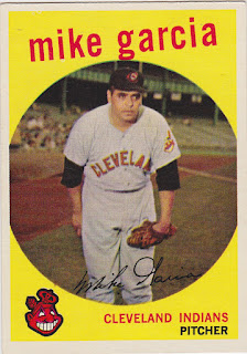
Yellow:
Red/red/black is the lettering combo.
Pink:
All lettering is black.
Black:
Yellow/yellow/white is the lettering combo.
Light Green:
And here I see enough variation in the card frames to make note of it. But given the color combo is consistent across all shade variations I believe the differences are due to the printing process. Black/yellow/black is the lettering combo.
The Gary Geiger card is from the high number Seventh Series and has a distinct 'lime-greenish' tinge to it. There is one other light green card in that series and the color is the same. As with other variations across colors I believe these to be simply printing anomalies. The lettering combos are the same across all the shades.
And finally, Orange:
I went back and forth in deciding whether of not Topps intended to print both 'orange'
and 'red-orange' cards. The differences are easy to see:
Because the color of the lettering is consistent, white/black/white, and the fact that there are some cards that fall between the darkest and lightest examples, I think that the cards were intended to be 'orange' and the variations are again, due to the printing process used. And I'm going to list them as being in the same category. I wish I had more insight into all this. There might be more info on the net.
In the next post I'll break the set down into card 'type' and list the American League breakdown by frame color.


